Music for Game Menus, Loading Screens, and UI Moments
Not every game music choice is a trailer choice.
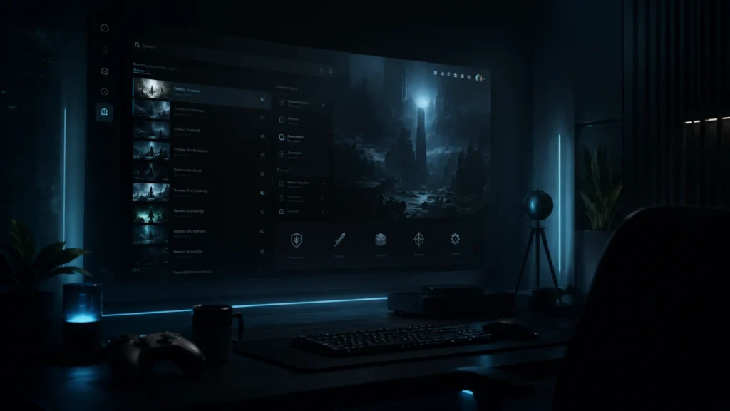
Menus, loading screens, inventory, level select, pause screens, upgrade panels, lobbies, and mission boards all shape how the player feels. They are not as loud as a trailer, but they appear more often. Sometimes they are the first thing a player hears after pressing start.
That makes them dangerous in a quiet way.
A track that sounds exciting for 20 seconds can become tiring after five menu visits. A cue that works in a launch video can make inventory management feel absurd. A beautiful emotional piece can make a simple settings screen feel like the final scene of a movie.
Menu Music Should Set The Contract
The main menu tells the player what kind of experience they are entering.
For a horror game, the menu may need low unease and space. For a tactics game, it may need focus and controlled tension. For a cozy game, it may need warmth without becoming sleepy. For a sci-fi interface, it may need clean pulse and synthetic texture.
Keep the contract honest. If the menu promises grand tragedy and the game begins with a small puzzle tutorial, the player feels the mismatch before they can explain it.
Loading Screens Need Patience
Loading music has one job many beginners forget: it may loop more than expected.
Short, dramatic phrases can become annoying quickly. Heavy percussion can make waiting feel longer. Huge melodic statements can feel silly if the load time is short and repeated.
Look for texture, light movement, or a cue that can sit in the background without demanding attention every time. If the player may hear it 50 times, choose restraint.
UI Music Has To Leave Room For UI Sound
Interface moments often have their own sound design: clicks, confirmations, purchase sounds, error tones, hover states, unlocks, item pickups, map pings, and mission accepts.
That is not just a taste issue. Game engines treat audio as a system of sources, listeners, clips, and mixes; Unity’s audio overview is a useful reminder that music lives beside many other sounds once it enters the game.
If the music is too dense, the UI loses tactility.
A good UI cue gives motion without filling every frequency. A soft pulse, narrow synth bed, small percussion loop, or atmospheric drone can support the interface while leaving space for feedback sounds. This is especially useful in sci-fi and cyberpunk games where UI is part of the fantasy, not just a menu layer.
Use Different Music Jobs For Different Screens
| Screen | Music job | Search language |
|---|---|---|
| Main menu | Set the emotional contract. | cinematic identity, soft tension, dark ambience, warm theme. |
| Loading screen | Stay patient and repeatable. | ambient bed, light pulse, subtle texture, calm loop. |
| Inventory or upgrade | Support decision-making. | minimal pulse, quiet system, focused synth, restrained underscore. |
| Lobby or level select | Create readiness without fatigue. | anticipation, low energy build, tactical bed, playful motion. |
| Mission board | Give purpose and direction. | briefing tension, cinematic planning, measured pulse. |
This is not soundtrack composition advice. It is a practical licensing and selection map for creators choosing existing music.
Search Music For Game Menus And UI
When One Cue Can Cover Several Screens
For a first game, you probably do not need separate music for every interface state. If you are still mapping the whole project, start with the first indie game music plan, then come back to menus and UI as their own quiet category.
One restrained cue might cover main menu, loading, and level select if it loops calmly. Another cue might cover upgrade screens, mission boards, and tactical planning. The trick is choosing music that does not announce itself too hard.
If one cue can do three quiet jobs, let it. If a screen needs its own cue, name the screen job before searching. That keeps the music decision connected to the interface, not to catalog wandering.
Run A Loop Fatigue Test
Loop the track for 10 minutes while doing something else.
If you start noticing the same phrase too often, the player will notice it faster. If the music still feels supportive without demanding attention, it may work for menu or loading use.
This test is not glamorous. It is very useful.
Think About Player Repetition
Menus and UI moments are not consumed like trailers. A trailer may be watched once or twice. A menu may be heard every time the game opens. A loading cue may repeat after every death, every fast travel, or every level change.
That changes the music choice. Strong hooks, big melodic statements, and aggressive percussion can feel exciting in a preview, then become exhausting through repetition. For interface music, restraint is not weakness. It is durability.
Ask what the player is doing while the music plays. Waiting, choosing, reading, comparing items, changing settings, or planning a mission all need space. The music should support that state without asking to be the main event.
Design Around Silence And Short Loops
Not every interface needs continuous music. Sometimes a short ambience, a low bed, or even silence with careful UI sound is stronger. First-time developers often over-score menus because silence feels unfinished during development.
Try three versions: no music, very quiet ambience, and a more active cue. If the active cue makes the screen feel more expensive without slowing the player’s thinking, it may be right. If it makes simple choices feel dramatic, use less.
This is especially useful for inventory screens, upgrade menus, settings, map screens, and loading loops. Those moments often benefit from sound that is felt more than noticed.
Match UI Music To The Game’s Interface Fantasy
Every interface has a fantasy. A spaceship menu, a handwritten journal, a tactical command board, a cozy workshop, and a haunted pause screen should not sound the same.
Choose texture before volume. A sci-fi interface might use clean pulses and glassy synths. A fantasy inventory might use soft strings, wood, or air. A horror menu might use low movement and unstable space. A tactics game might use restrained rhythm that suggests planning rather than combat.
The goal is not to make the menu impressive. It is to make the interface feel like it belongs to the world of the game.
Screen-By-Screen Examples
A main menu can carry the strongest identity because it is the player’s first calm look at the game. It can be more memorable than a loading cue, but it still needs to survive repeated visits.
A pause screen usually needs less. The player may be stepping away, changing settings, or thinking. Music that pushes too hard can make the pause feel stressful.
An inventory screen needs room for item sounds, comparison, reading, and decision-making. A soft pulse or texture can help, but dense music can make the interface feel cluttered.
A lobby or matchmaking screen can use more anticipation, because the player is waiting for action. Still, it should not exhaust them before play begins.
A mission board can suggest purpose. This is a good place for controlled tension, briefing energy, or tactical focus, especially if the player is choosing what to do next.
How To Search For UI Music
Search by function rather than genre. Instead of only typing “sci-fi music,” try phrases like calm interface, tactical planning, subtle tension, ambient bed, menu identity, focused pulse, quiet suspense, or warm loop.
Then test the track with the actual screen. If the screen has clicks, hovers, confirmations, or item sounds, play those with the music. If the screen has text, read the text while the music plays. If the screen loops, let the music loop longer than feels necessary.
Good UI music often feels underwhelming in a catalog preview. That is normal. Its job is not to win the preview. Its job is to make the screen feel designed after the tenth visit.
When To Use No Music
No music is a valid choice. A settings screen, accessibility menu, pause menu, or inventory may work better with ambience and UI sound only. Silence can make the game feel calmer and more readable.
The question is not “does this screen need music?” The better question is “what does the player need while this screen is open?” Sometimes the answer is focus. Sometimes it is anticipation. Sometimes it is relief.
If music does not improve that state, remove it or make it much smaller.
The UI Music Rule
Music for menus and UI should make the game feel designed, not over-scored.
Choose tracks that can repeat, leave room for interface feedback, and match the emotional contract of the game. The player may not praise the menu music out loud. They will feel when it belongs.